- Packages I will use to read in and plot the data
- Read the data in from part 1
Interactive graph
- Start with the data
- Use pivot_longer to graph
- Use e_charts to create an e_charts object with percentage on the x axis
- Use e_bar to build bars that contain global vaccine rates by disease. The depth of each bar represents the amount of vaccinations for each disease.
- Use e_tooltip to add a tooltip that will display based on the axis values
- Use e_title to add a title, subtitle, and link to subtitle
- Use e_theme to change the theme to roma
regional_vaccines   %>%
  pivot_longer(cols = 1:12, names_to = "disease", values_to = "percent") %>%
  arrange(percent)  %>%
  e_charts(x = disease)   %>%
  e_bar(percent, legend=FALSE)  %>%
  e_flip_coords() %>%
  e_tooltip(trigger = "axis")  %>%
  e_title(text = "Global Vaccination Coverage, by disease",
          subtext = "(in percentages). Source: Our World in Data",
          sublink = "https://ourworldindata.org/vaccination#global-vaccine-coverage",
          left = "center")  %>%
  e_theme("roma")
Static graph
- Start with the data
- Use ggplot to create a new ggplot object. Use aes to indicate that Year will be mapped to the x axis; diseases will be mapped to the y axis; percentage will be the fill variable
- geom_area will display vaccination coverage
- theme_classic sets the theme
- theme(legend.position = “bottom”) puts the legend at the bottom of the plot
- labs sets the y axis label, fill = NULL indicates that the fill variable will not have the labelled Region
regional_vaccines   %>%
  pivot_longer(cols = 1:12, names_to = "disease" , values_to = "percent") %>%
  ggplot(aes(x = percent, y = disease)) +
geom_col() +
  geom_area() +
  theme_classic() +
  theme(legend.position = "bottom") +
  labs( y = "disease",
       fill = NULL)
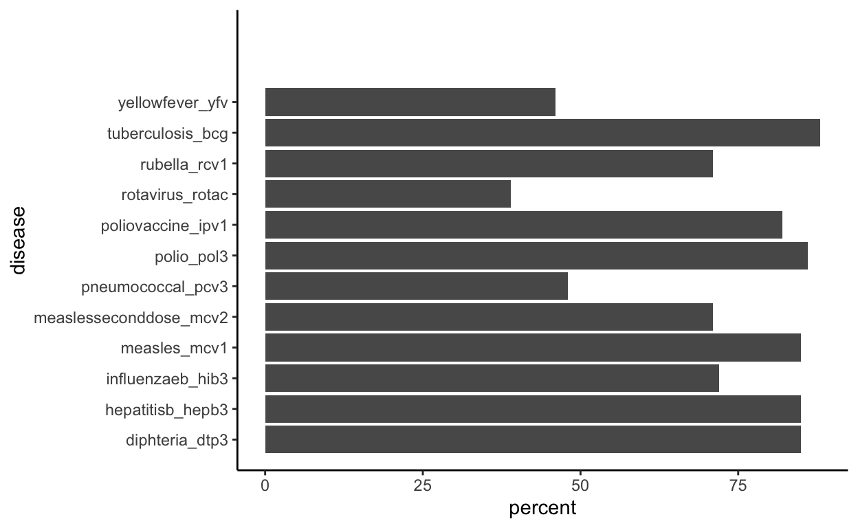
These plots show what diseases have the highest vaccination coverage in percentages. Globally, Tuberculosis has the highest vaccine rate at 88% and the lowest being Rotavirus at 39%.